


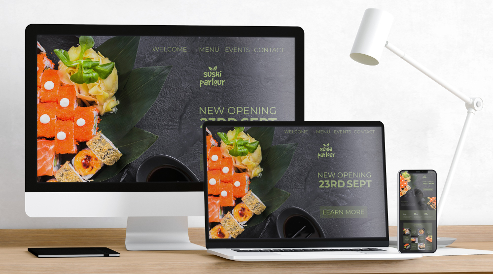
A responsive website adjusts its layout and design based on the device it’s being viewed on. Whether you’re using a desktop, tablet, or smartphone, a responsive website ensures the content looks great and is easy to use. But why does this matter?
Why Do You Need a Responsive Website?
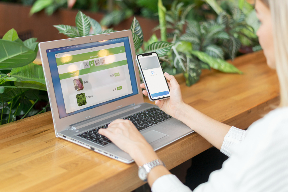
One Website for All Devices
With a responsive website, you don’t need separate versions for mobile and desktop users. The design adapts automatically, making navigation smooth and intuitive on any device.
Increased Time on Site
Users are more likely to stay on a site that is easy to navigate. A responsive layout ensures that visitors can find what they need quickly, leading to longer time spent on your website.
Google Prioritizes Mobile-First Indexing
Google’s algorithms now prioritize mobile-friendly websites in search rankings. Having a responsive site improves your chances of appearing higher in search results.
One URL for SEO Consistency
A responsive design uses a single URL for both desktop and mobile, helping to concentrate SEO efforts and avoid issues with duplicate content.
No Need for Separate Mobile Sites
In the past, businesses often created two separate sites—one for desktop and one for mobile. With responsive design, you maintain just one site, reducing costs and effort.
Simplified Maintenance
Because changes apply to one site across all devices, you save time and resources on updates.
Learn why responsive websites are crucial for user experience and business success in today’s digital landscape.
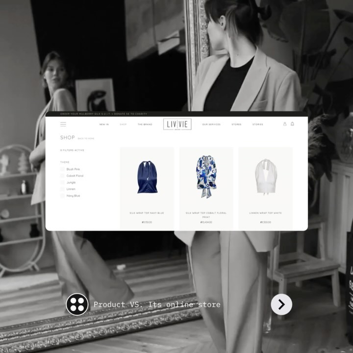
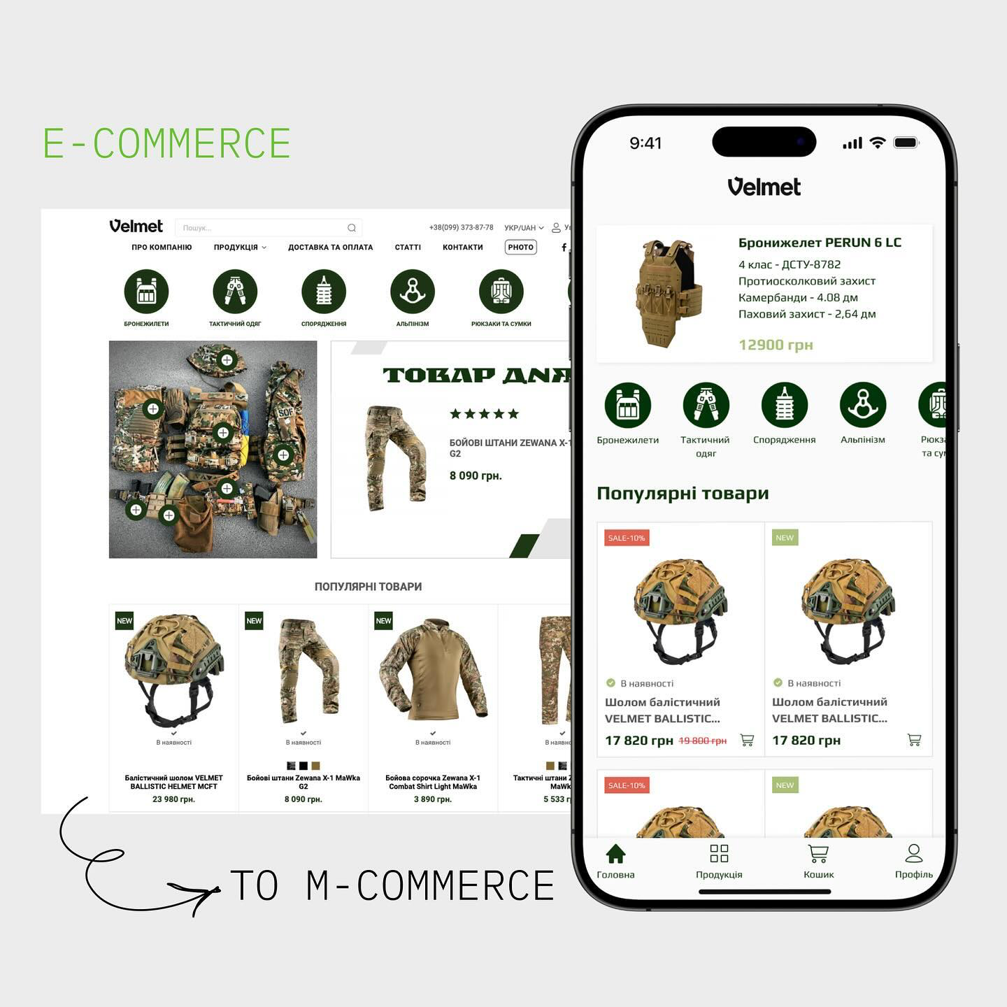
Mobile Optimization for E-Commerce
More and more people are shopping on their phones. If your site isn’t optimized for mobile, you’re losing potential customers. A responsive website ensures that your online store looks great and functions smoothly across all devices.
Meeting User Expectations
In today’s world, users expect websites to work seamlessly on their smartphones and tablets. A responsive design ensures your business meets these expectations.
A Responsive Website is a Must-Have
In a world where mobile usage continues to rise, having a responsive website is crucial. It ensures your business can reach a broader audience while delivering an optimal user experience. If you’re ready to make your website mobile-friendly, contact HKDEVOTION for expert advice and solutions.

You can contact us on the contact form on this website or contact us through the email at contact@hkdevotion. com. We can also be contacted on Tel: +351 916 651 396.
Our office is located in the most beautiful location in Europe: Rua da Alegria, n.o 31, 1.o F, 9000 040 Funchal, Madeira, Portugal and you are always welcome to visit us personally.
Follow us on social media platforms to get the recent updates on the projects we are implementing. Remember to subscribe to our newsletter to get the latest news on our services.